top of page
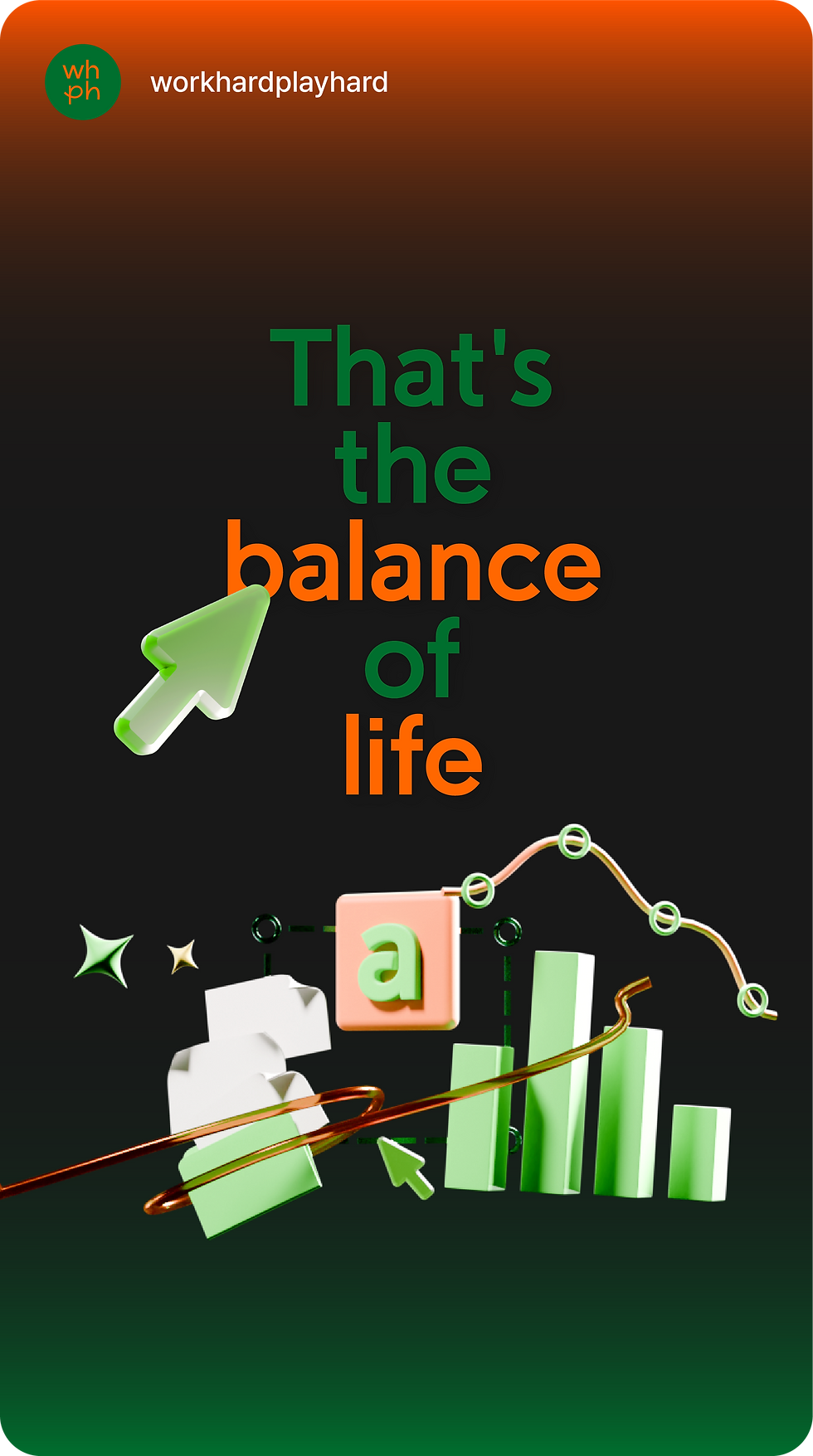
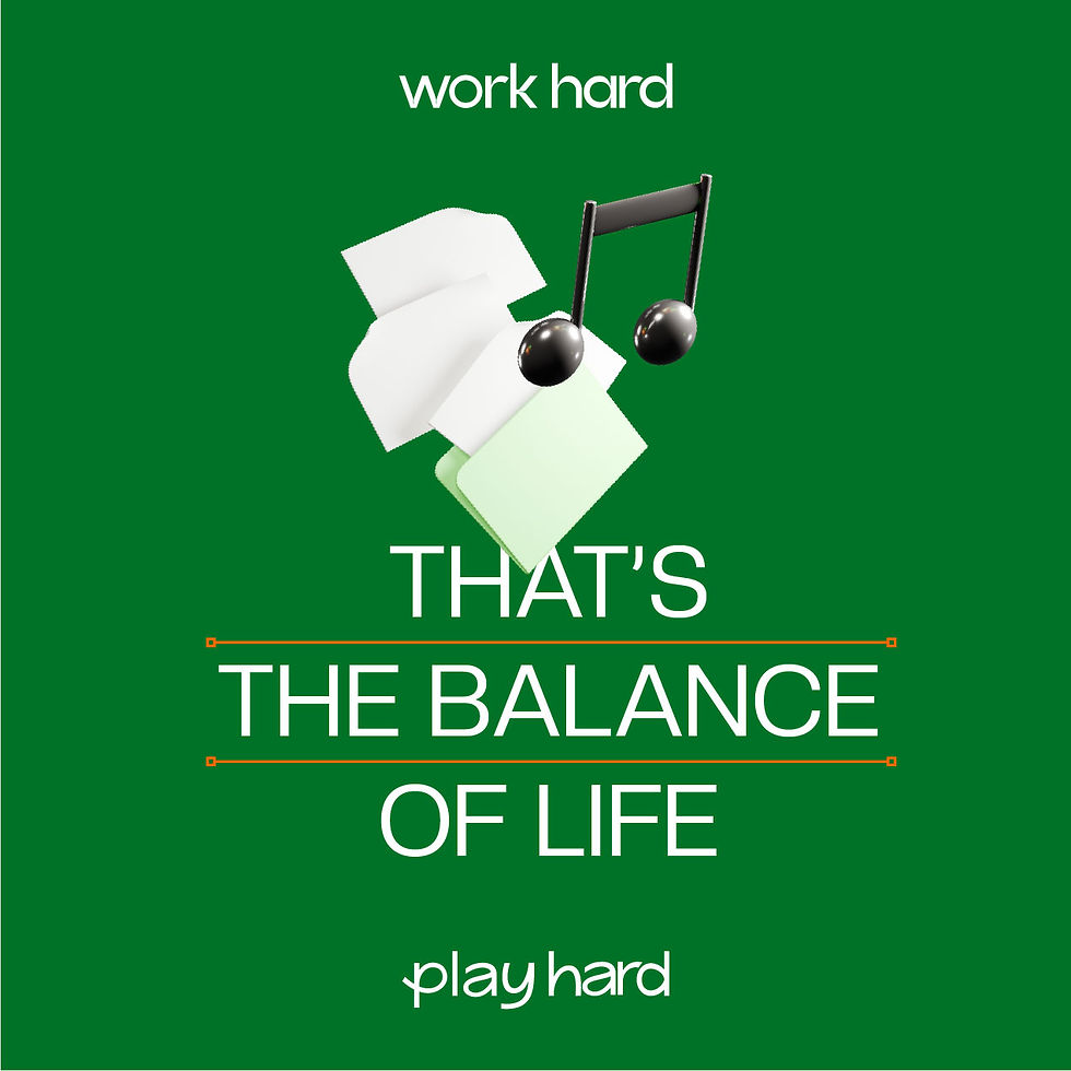
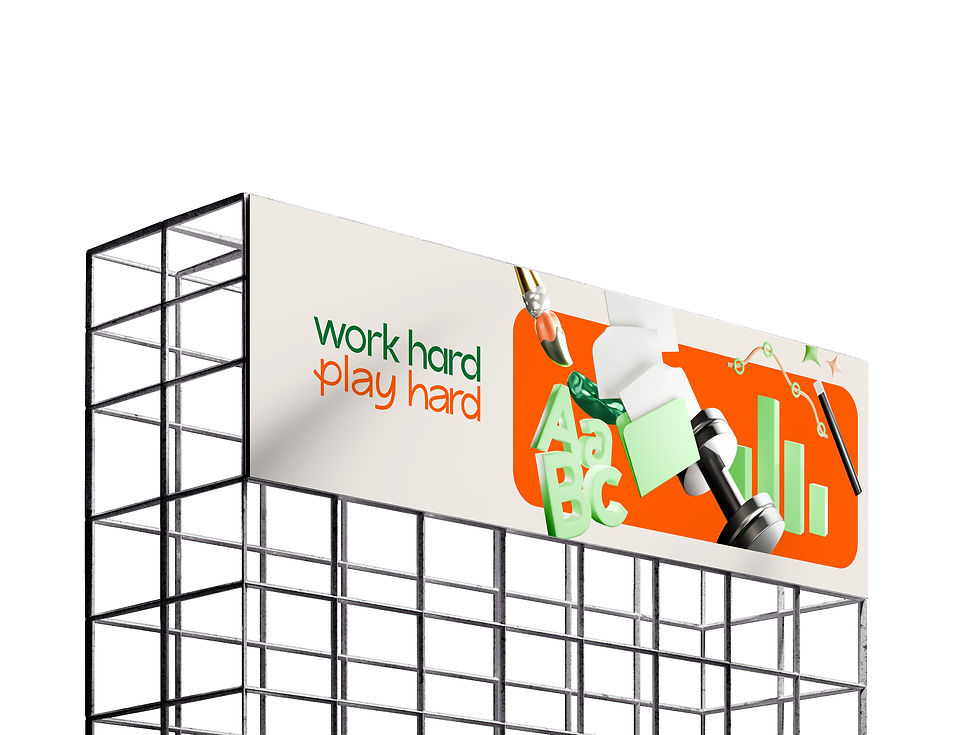
That's the
balance of life.


CREATIVE DIRECTION
D.BRONZE
UI | UX | GUI
Project Management - D.BRONZE
UI | UX Design - D.BRONZE
Icon Design - D.BRONZE
PROJECT
COMMAX WallPad UI | UX Design

CREATIVE DIRECTION
D.BRONZE
Branding
UI | UX | GUI Design
Project Management
Icon Design
Application Design
PROJECT
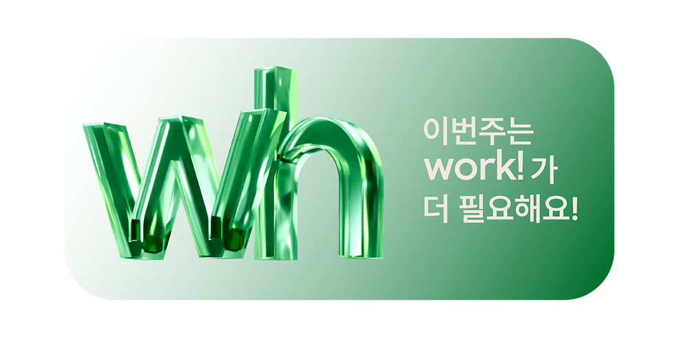
WHPH Branding | UI/UX | Application Design


Project Overview
To enhance quality of life in daily routines, it is essential to maintain a balance between work and leisure for a healthy and happy existence. By helping individuals easily understand the tools needed for both work and hobbies, and by minimizing learning time and trial and error, we truly embody the value of 'work hard, play hard.
매일 반복되는 일상에서 삶의 질을 높이기 위해, 일과 취미의 균형을 유지하는 것은 건강하고 행복한 삶을 지속하는 핵심입니다.
업무와 취미에 필요한 툴을 쉽게 이해하도록 안내하고, 학습 시간과 시행착오를 줄여 몰입할 수 있게 도와주는 것이 바로 "work hard, play hard"의 가치입니다.

Brand Feature


work time
play time
일과 삶의 조화를 위해 다양한 노하우를 전달하는 WorkHard PlayHard는 정보 전달을 넘어 사용자와의 직접적인 피드백을 통해 정확한 정보 확인과 전달을 실현하는 신뢰성 있는 플랫폼으로 가치를 확대
단순 정보를 제공하는 이미지를 강조하기보다는 플랫폼 접근을 유도하는 방향성을 추구하였으며, 일과 삶의 균형을 위한 노하우를 동시에 전달하는 이미지를 중심으로 브랜드 아이덴티티 작업을 진행
Brand Definition
일과 삶의 조화를 위해 다양한 노하우를 전달하는 WorkHard PlayHard는 정보 전달을 넘어 사용자와의 직접적인 피드백을 통해 정확한 정보 확인과 전달을 실현하는 신뢰성 있는 플랫폼으로 가치를 확대하고 있습니다. 단순 정보를 제공하는 이미지를 강조하기보다는 플랫폼 접근을 유도하는 방향성을 추구하였으며, 일과 삶의 균형을 위한 노하우를 동시에 전달하는 이미지를 중심으로 브랜드 아이덴티티 작업을 진행했습니다.
In-depth
User Interview.


In-depth
User Interview. 01

.png)


In-depth
User Interview. Step1


Brand Core Value
Easy access
한글 설명 적어 놓기

The separation of
work and play
일과 취미 카테고리 분리를 통해 컨텐츠 접근성과 체류시간 상승 및 다양한 타겟층을 공략

Work-life balance
컨텐츠의 시각적인 분리를 통해 일과 취미의 밸런스를 맞추고 해당 콘텐츠의 전문성을 강조


Accurate information
한글 설명 적어 놓기
work hard
Optimizing Efficiency and Saving Time
By providing quick solutions, it reduces time
spent on tasks and increases work efficiency.
play hard
Recharging and Refreshing Through Hobbies
By introducing various hobbies, it helps you find
the right activities for recharging and refreshing yourself.
In-depth
User Interview. Step2

검색에 많은 시간이 소요됨
(하나의 앱이나 플랫폼에서 찾기 어려워 여러 곳을 검색해야 함)
답변을 얻기 위해 긴 영상을 모두 시청해야 하는 시간

정확한 답변을 얻기가 어렵다

답변의 정확성을 파악하기 어려움
Brand Core Value

Core value 1
Accurate information
dissemination
한글 설명 적어 놓기
Core value 2
Comfortable and
easy access
한글 설명 적어 놓기
Core value 3
Boundless reliability
in the field
한글 설명 적어놓기
Brand Core Value
Core value 4
Work-life balance
한글 설명 적어놓기


To effectively manage work and leisure activities, it is crucial to cultivate a habit of clear transitions between the two. Just as one switches a light on and off, allocating focused time to each activity proves beneficial. This practice enhances quality of life and maximizes productivity.
That's the balance of life.
Brand Essence

That's the balance of life.


Brand Logo
The "Work Hard, Play Hard" font logo emphasizes the visual contrast between "work" and "play" while maintaining overall harmony. "Work Hard" uses an ink-trap font design with straight lines, highlighting efficiency and precision, while "Play Hard" employs smooth curves and visual adjustments to convey a sense of freedom and balance.
work hard play hard의 폰트로고
work와 play 시각적 차이점을 보여줌과 동시에 로고 간 조화로움이 주 포인트로 work hard는 직선의 라인 이미지와 효율을 강조한 ink trap 폰트 디자인으로 play hard는 자유로운 곡선과 조화로움을 위한 시각보정을 적용한 폰트 디자인으로 제작하였습니다.
Push yourself to the limit and achieve your goals with dedication. When it's time to relax, make every moment count and enjoy to the fullest. Embrace the balance between hard work and exhilarating play.
자신의 한계를 극복하며 열정적으로 목표를 달성하세요. 휴식 시간에는 모든 순간을 소중히 여기고 최선을 다해 즐기세요. 열정적인 노력과 신나는 여가 사이의 완벽한 균형을 추구하세요.

To effectively manage work and leisure activities, it is crucial to cultivate a habit of clear transitions between the two. Just as one switches a light on and off, allocating focused time to each activity proves beneficial. This practice enhances quality of life and maximizes productivity.

일과 취미 활동을 균형 있게 관리하기 위해서는 두 활동 간의 명확한 전환 습관이 중요합니다. 스위치를 켜고 끄듯이 각 활동에 집중하는 시간을 정하는 것이 효과적입니다. 이는 삶의 질을 높이고 생산성을 극대화하는 데 도움이 됩니다.
To effectively manage work and leisure activities, it is crucial to cultivate a habit of clear transitions between the two.
Just as one switches a light on and off, allocating focused time to each activity proves beneficial. This practice enhances quality of life and maximizes productivity.
일과 취미 활동을 균형 있게 관리하기 위해서는 두 활동 간의 명확한 전환 습관이 중요합니다. 스위치를 켜고 끄듯이 각 활동에 집중하는 시간을 정하는 것이 효과적입니다.이는 삶의 질을 높이고 생산성을 극대화하는 데 도움이 됩니다.
.jpg)


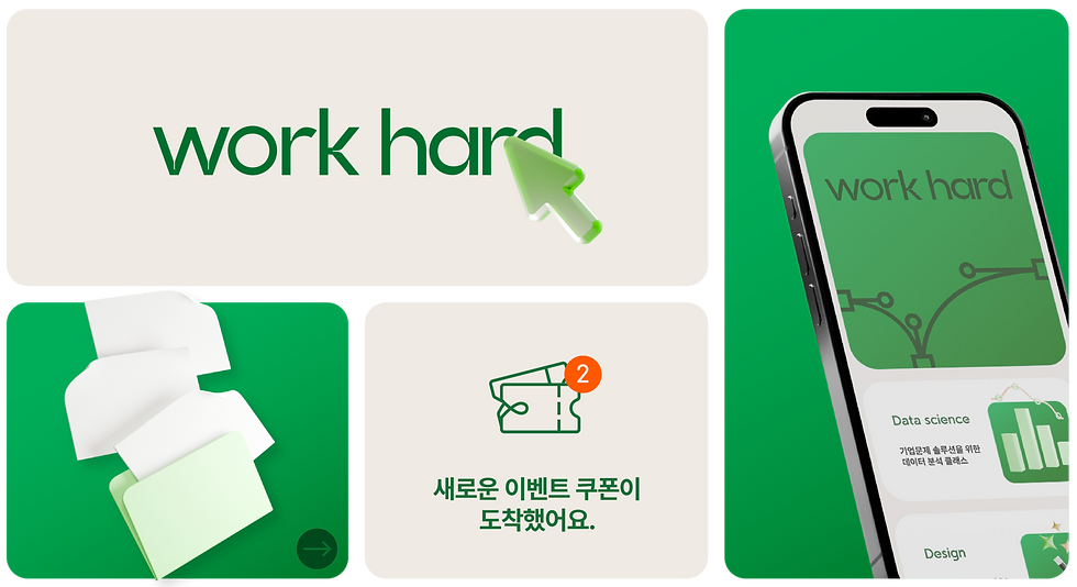
Work Hard Play Hard는 업무의 효율성과 취미의 조화를 통해 개인의 생활 리듬을 높이고 삶의 질을 향상시키는 가치를 제공합니다. 사용자가 쉽고 빠르게 정보를 취득할 수 있도록, 워크와 플레이를 시각적으로 분류하고, 높은 정보 선별 기준을 적용해 원하는 정보를 신속하게 얻을 수 있는 브랜드 아이덴티티를 구축했습니다.
"Work Hard Play Hard" enhances personal life rhythm and quality by balancing work efficiency with the enjoyment of hobbies. To help users access information quickly and easily, we’ve created a brand identity that visually distinguishes work and play, applying high standards for information selection to ensure users can find exactly what they need, fast.
Work Hard Play Hard는 업무의 효율성과 취미의 조화를 통해 개인의 생활 리듬을 높이고 삶의 질을 향상시키는 가치를 제공합니다. 사용자가 쉽고 빠르게 정보를 취득할 수 있도록, 워크와 플레이를 시각적으로 분류하고, 높은 정보 선별 기준을 적용해 원하는 정보를 신속하게 얻을 수 있는 브랜드 아이덴티티를 구축했습니다.
Work Green
R25 G109 B53
C87 M47 Y100 K10
#196D35
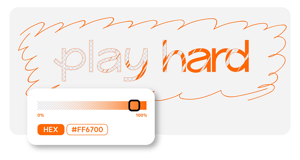
Play Orange
R255 G103 B0
C0 M73 Y93 K0
#FF6700
Sub Color
R49 G173 B99
C74 M10 Y77 K0
#31AD63

Sub Color
R255 G126 B39
C0 M64 Y83 K0
#FF7E27

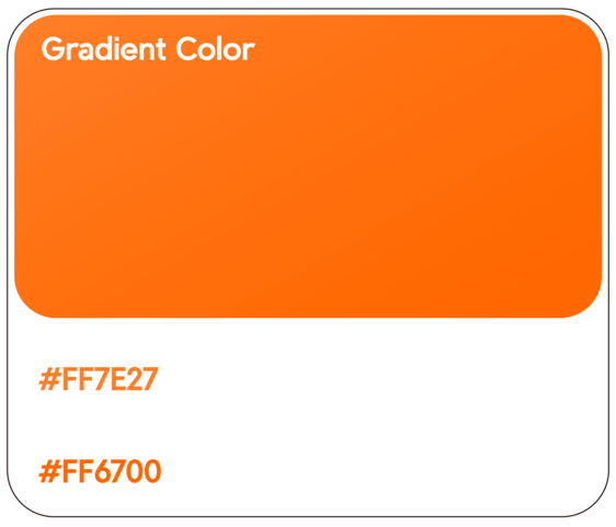
Gradient Color
Gradient Color
#196D35 → #31AD63
#FF6700 → #FF7E27


3D Brand Mark


Brand Color
Brand Color
Sub Color
#000000
#3D3D3D
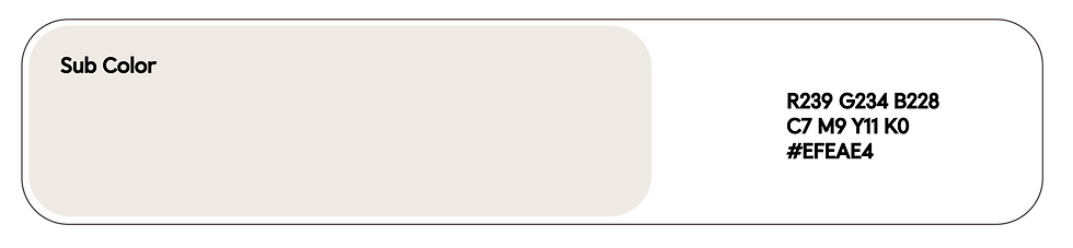
Sub Color
R239 G234 B228
C7 M9 Y11 K0
#EFEAE4
Sub Color
Typography
Typography
Brand Color


Brand Color


Brand Color
Typography


Application Graphic Asset


IA (Information Architecture)


%20(1).png)

.png)
.jpg)
사용자들이 원하는 카테고리에 빠르게 접근할 수 있도록 Main Page를 심플하고 직관적으로 구성하였습니다.

.png)
%20(1)%20(1).png)
사용자들이 원하는 카테고리에 빠르게 접근할 수 있도록 Main Page를 심플하고 직관적으로 구성하였습니다.


사용자들이 원하는 카테고리에 빠르게 접근할 수 있도록 Main Page를 심플하고 직관적으로 구성하였습니다.
.jpg)
2D Icon


Pictogram 2D Icon
.jpg)


3D Assets


We designed the interior signage and overall concept for the Work Hard Play Hard office. Icons were created in line with the brand identity, and the main brand color was used as a focal element in the interior. The overall tone follows a warm ivory theme to create a cohesive and inviting atmosphere.
Work Hard Play Hard의 오피스에 사용되는 Interior Signage 및 인테리어 컨셉 제작을 하였습니다.
브랜드 아이덴티티에 맞추어 아이콘이 제작이 되었으며 Main컬러가 인테리어의 포인트 요소로 사용될 수 있게끔 전체적인 인테리어 톤은 웜톤의 아이보리를 사용한 컨셉 입니다.


Interior Signage
.jpg)


Core value 1
Accurate information
dissemination
한글 설명 적어 놓기
Core value 2
Comfortable and
easy access
한글 설명 적어 놓기
Core value 3
Boundless reliability
in the field
한글 설명 적어놓기
Core value 4
Work-life balance
한글 설명 적어놓기


In-depth
User Interview. Step1

Spend a lot of time
검색에 많은 시간이 필요하며 하나의 앱이나 플랫폼에서 찾기 어렵거나
허비되는 시간이 많이 소요
Difficulty getting an answer
정확한 솔루션을 얻기 어렵거나 필요없는 답변으로 유입되는 경우 발생
Difficulty assessing the accuracy of the response
솔루션의 정확성을 판단하기 어려움으로
솔루션의 정확성 강화를 위한 사용자와의 피드백 강화
Difficulty assessing the accuracy of the response
솔루션의 정확성을 판단하기 어려움으로
솔루션의 정확성 강화를 위한 사용자와의 피드백 강화
In-depth
User Interview. 02
Brand Essence
TOOLTOOL의 브랜드 에센스를 “WE ARE ALWAYS NECESSARY BEINGS.” 으로 정의합니다.
TOOLTOOL은 고객들의 필요에 집중하며, 필수적인 서비스나 제품을 제공합니다.
“항상 필요한 존재” 로서 소비자를 존중하고 그들의 필요를 가치 있게 여기는 것이 TOOLTOOL의 가치 입니다.
또한 고객들은 제품을 넘어 신뢰성을 제공받고 있다는 메세지를 받게 됩니다. 소비자들이 비즈니스나 브랜드를 믿고 의지할 때, 특별한 관계를 형성하게 되는 의미를 내포하는 브랜드 에센스 입니다.
We define the brand essence of TOOLTOOL as "WE ARE ALWAYS NECESSARY BEINGS." TOOLTOOL focuses on the needs of customers and provides essential services or products. Respecting consumers as "always necessary beings" and valuing their needs is the core value of TOOLTOOL. Additionally, customers receive a message that they are receiving reliability beyond just products. This brand essence embodies the significance of forming a special relationship when consumers trust and rely on a business or brand.
.png)

That's the balance of life.
Brand Essence

To effectively manage work and leisure activities, it is crucial to cultivate a habit of clear transitions between the two. Just as one switches a light on and off, allocating focused time to each activity proves beneficial. This practice enhances quality of life and maximizes productivity.
work hard
Optimizing Efficiency
and Saving Time
By providing quick solutions, it reduces time
spent on tasks and increases work efficiency.
시간 절약과 효율의 극대화
빠르게 솔루션을 제공해 주어 업무에 있어서 시간을 단축시키고, 업무효율 상승
play hard
Recharging and Refreshing
Through Hobbies
By introducing various hobbies, it helps you find
the right activities for recharging and refreshing yourself.
취미를 통한 에너지 충전과 리프레쉬
다양한 취미를 알려주며, 나에게 맞는 취미활동을 찾아 에너지 충전과 함께 리프레쉬
Brand Core Value
Easy access
한글 설명 적어 놓기
The separation of
work and play
일과 취미 카테고리 분리를 통해 컨텐츠 접근성과 체류시간 상승 및 다양한 타겟층을 공략
Work-life balance
컨텐츠의 시각적인 분리를 통해 일과 취미의 밸런스를 맞추고 해당 콘텐츠의 전문성을 강조
Accurate information
한글 설명 적어 놓기
bottom of page